Cardinal Branding Guide
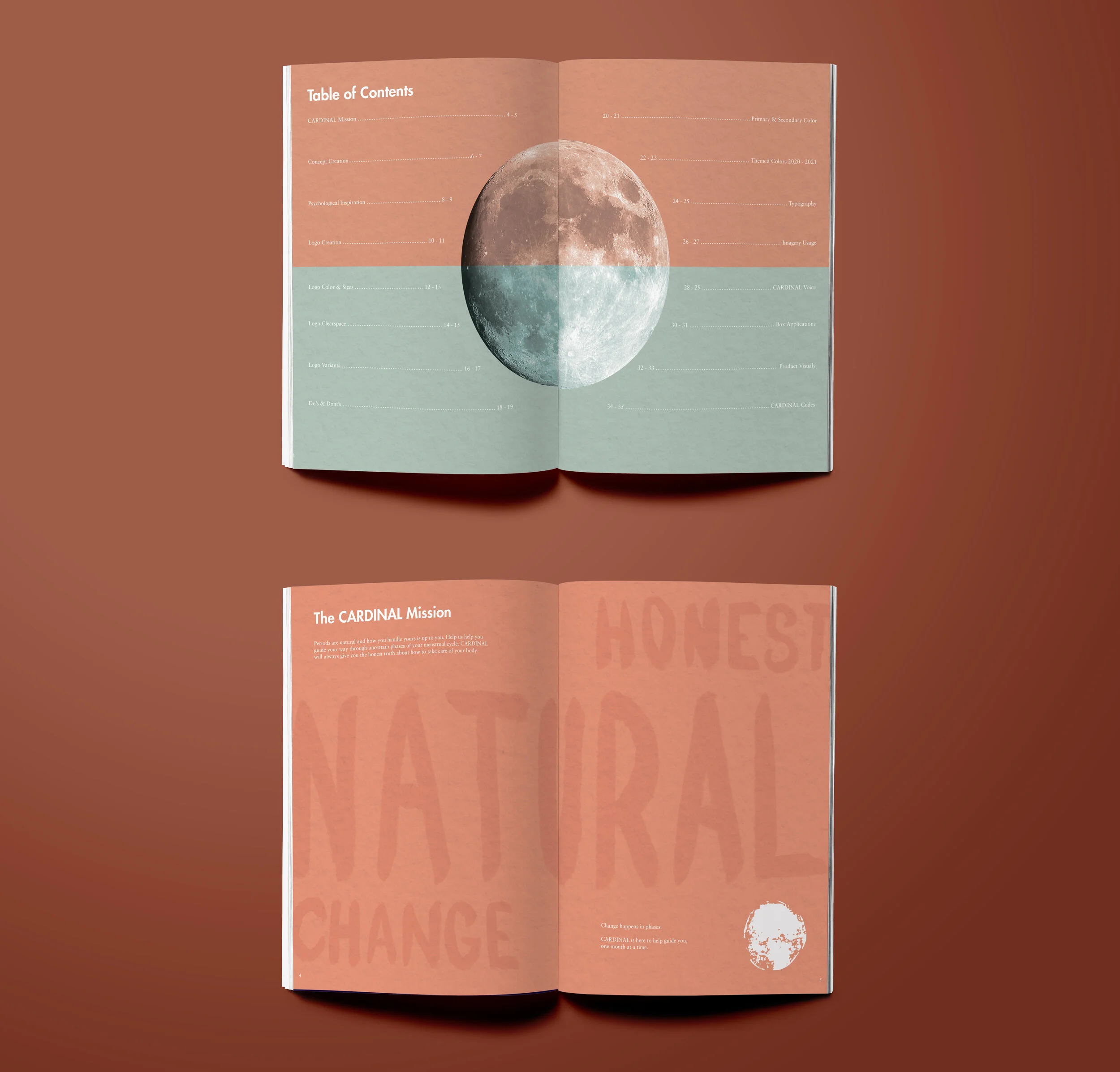
“Cardinal” is a subscription box brand created for adolescents experiencing their first menstrual cycle. The goal of the project was to develop a brand identity that felt approachable, supportive, and educational rather than clinical, helping normalize an experience that is often surrounded by stigma or uncertainty.
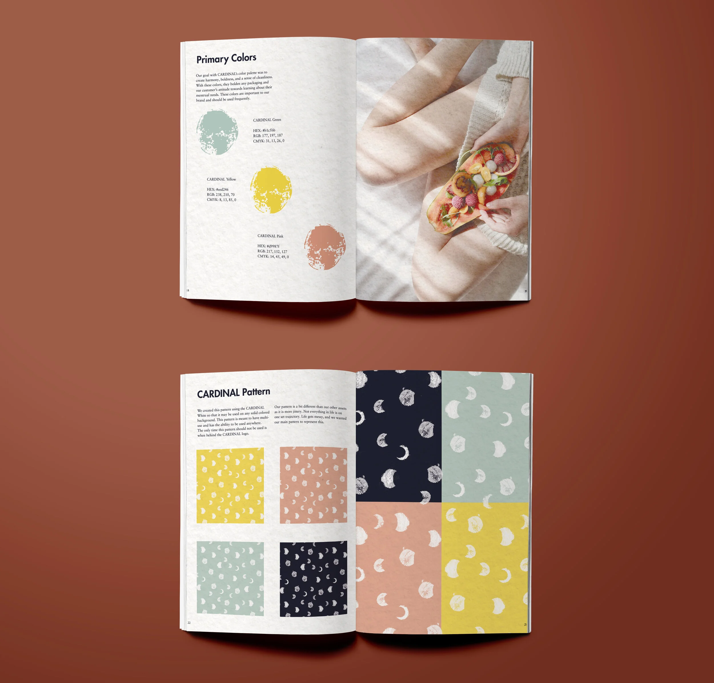
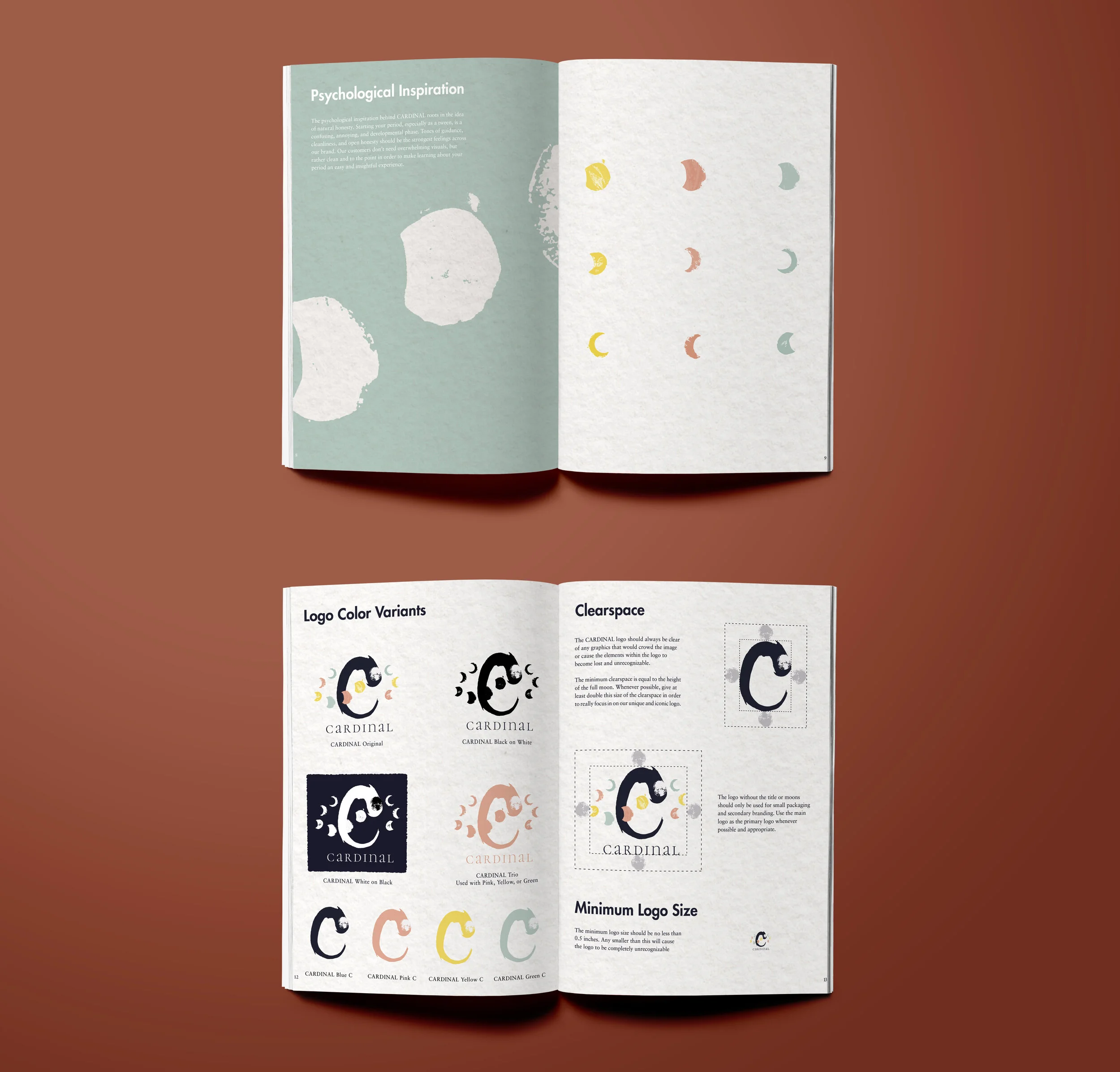
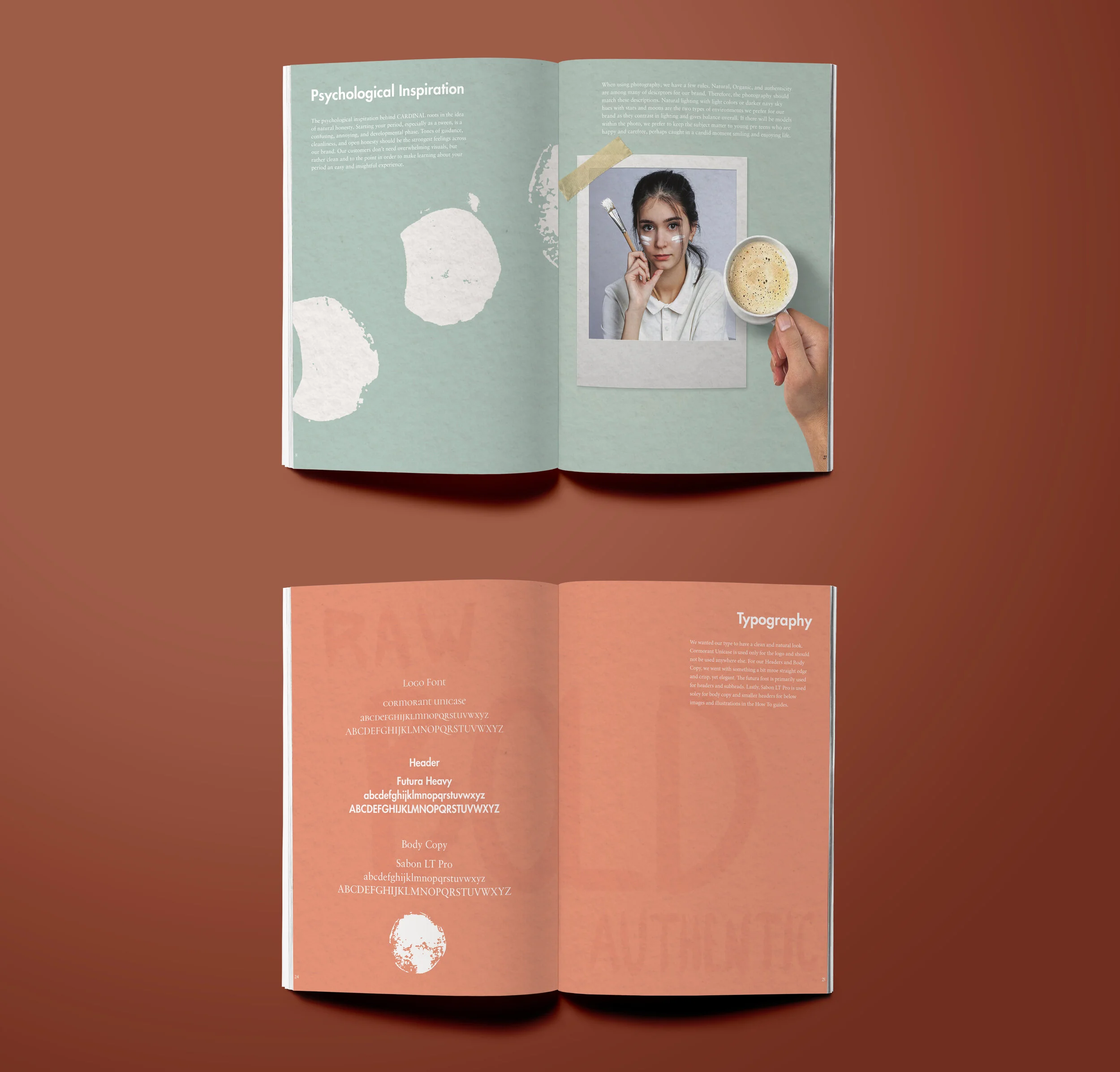
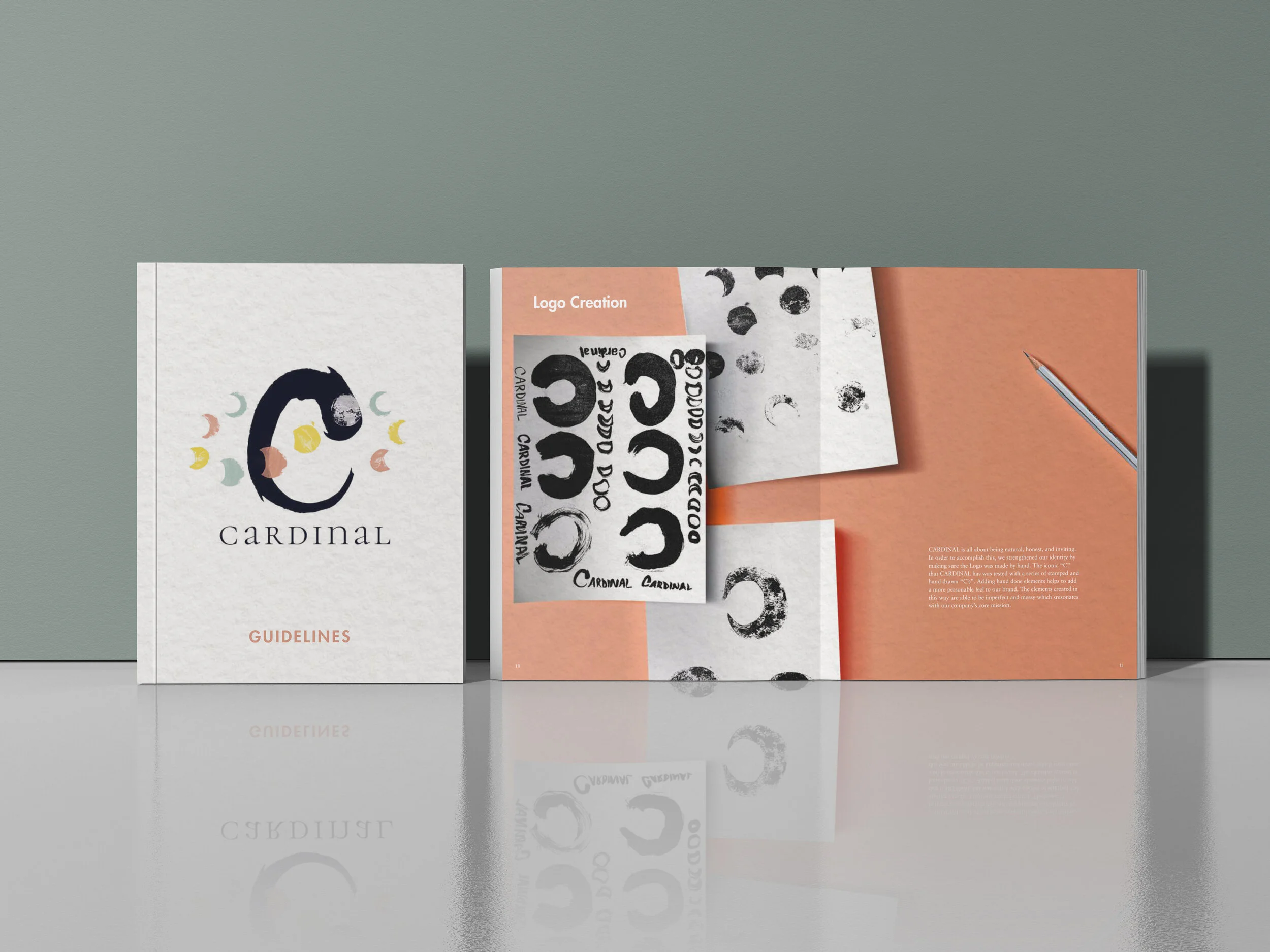
The name “Cardinal” references both the deep red color associated with the menstrual cycle and the idea of something essential or fundamental, reinforcing the importance of understanding one’s body. I created moon-cut stamp elements as a reference to lunar cycles as an analogy for bodily cycles, and brushed the logo’s iconic “C” with ink to introduce a handmade quality that reinforces comfort and care. A palette of light pinks, greens, and yellows helped establish a tone that feels clean, friendly, and reassuring across the system, which was applied to a printed subscription box prototype to demonstrate how the identity translates to a physical format.